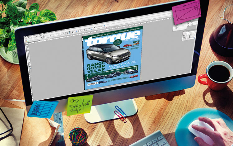
 Not everyone is artistically inclined, but if you love reading Torque, then you’re probably drawn to this magazine’s design, too.
Yes, nice images are important. But whoever says that a car magazine is “just a collection of photos and words” has never worked for a print publication.
Indeed, Torque wouldn’t be an award-winning magazine without its art team, which consists of an art director and senior designer.
Our art team’s primary responsibility is to produce layouts. In a nutshell, this means placing pictures and text on pages.
But if you think that templates make their job easier, you’d be mistaken. The task of creating layouts isn’t just about “cutting and pasting”.
The most important layout is the magazine’s cover. Before deciding on the cover’s colour theme, our art director must carefully consider the cover car, cover lines and past colours used.
And if our current art director had been working for Torque a decade ago, he’d also have to consider the cover girl and her wardrobe. I told him that he’s lucky not to have these added complications, but I’m pretty sure he feels otherwise.
Jokes aside, drafting a good layout is akin to a chef preparing a dish. Imagine dining at a Michelin-starred restaurant. You order a medium-rare steak with garlic mashed potatoes and creamed spinach on the side. But instead of the ingredients being plated properly, they’re thrown into a blender and pureed, before being served to you in a large bowl.
The dish would be unappetising, to say the least.
So, to deliver a polished product, we go through numerous discussions, arguments and compromises before deciding on layouts.
For instance, before the last revamp of Torque in 2015, some casual readers and non-enthusiasts felt that our three-car Group Test layout was tricky to navigate.
Although we initially felt that we had to give readers as many details as possible, we later realised that we needed to simplify the design to present the story more clearly to readers.

Our senior writer feels that Torque covers like this one had more “dangerous curves”.
The current layout is much better. A reader’s wife actually e-mailed us, praising the revised layout. She said it was so organised that she actually got hooked on our magazine, and ended up surprising her hubby with her newfound knowledge about cars!
But our art team doesn’t just determine page layouts, font styles and font sizes. It is also instrumental in holding photographers to our magazine’s standards.
Our in-house photogs cannot just specialise in cars. They have to shoot everything from food to fashion. That’s why it’s essential to have a member of our art team at photo shoots.
Naturally, we prefer working with photogs who are more familiar with our requirements.
And when it comes to freelancers, we usually work with the same two guys, who we consider to be the best in the field of automotive photography.
These two fellas are so talented and hardworking that even car dealers are willing to spend more money to hire them instead of other photographers who charge less, but may not always deliver the desired results.
But even after the photographers deliver great images, the job of our art guys isn’t over. They will spend time cleaning up the photos, using digital “magic” to remove “photobomb” elements (such as lamp posts and street signs) that add clutter to a picture.
However, they must be careful not to overdo this, lest the photos look too artificial.
Photos and layouts aside, our art team has become adept at shooting and editing short video clips, too. Our “Guess The Car!” contests on Torque’s Facebook page, for instance, wouldn’t be possible without their skills.
But for all their contributions, our art team never gets invited to lunch by marketing or PR managers, who seem to have overlooked the fact that Torque couldn’t function, much less exist, without it.
Perhaps more industry folks and readers will realise this after reading my ode to art.
Jeremy spends a lot of time with the art team, but remains woefully clueless when it comes to creating layouts.
Related story: Head over heart?
Related story: Electric nightmare for petrolheads


